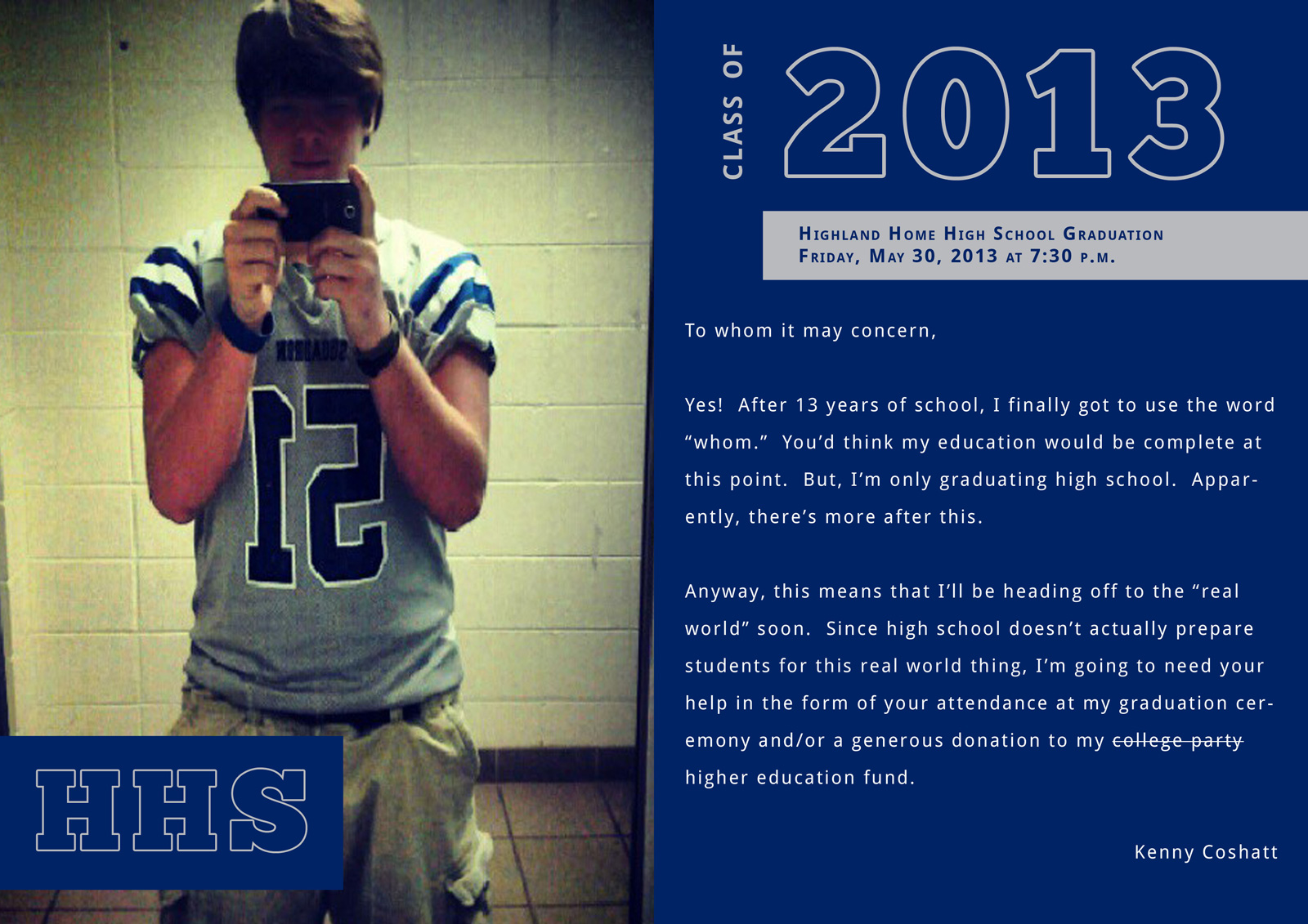
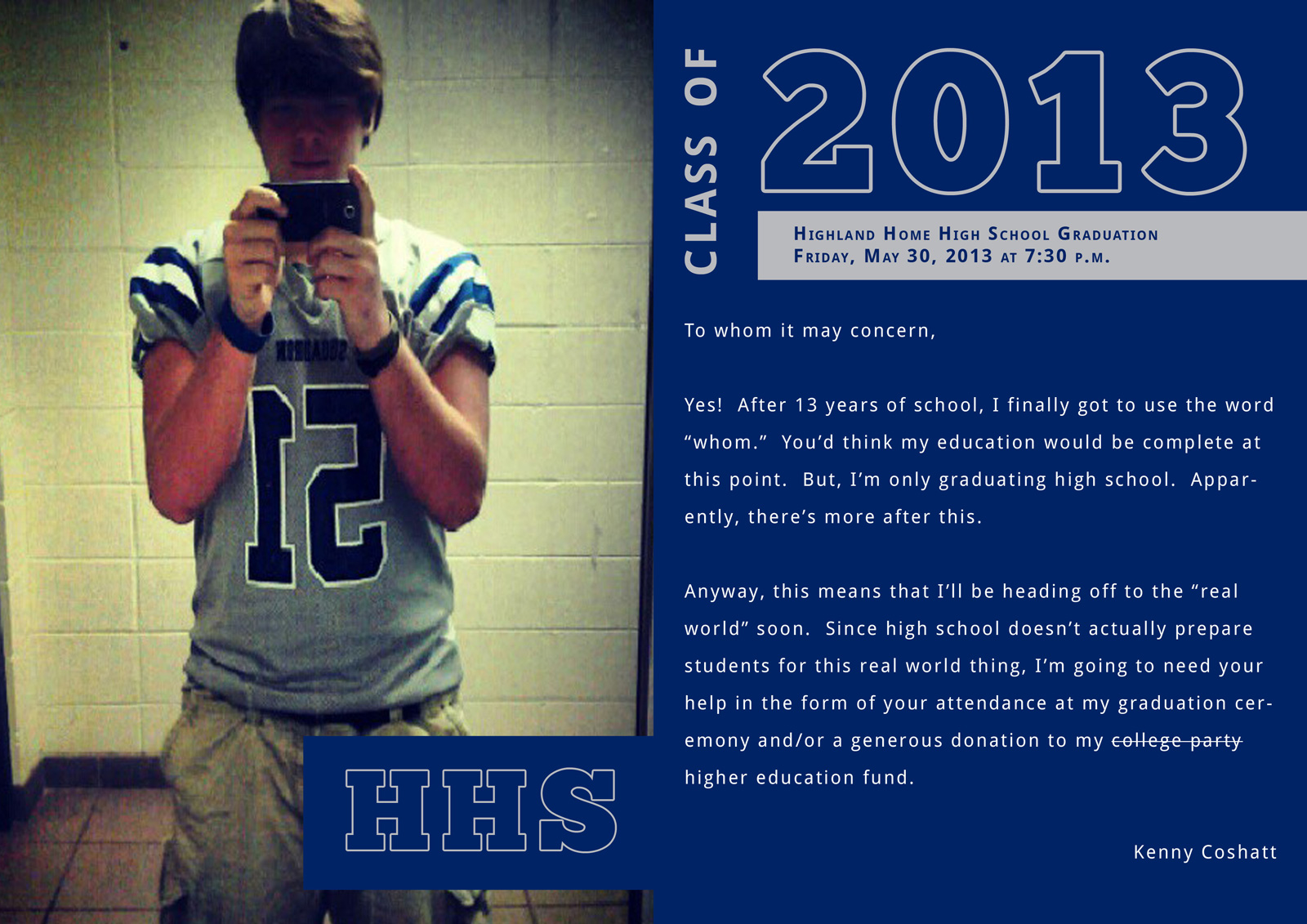
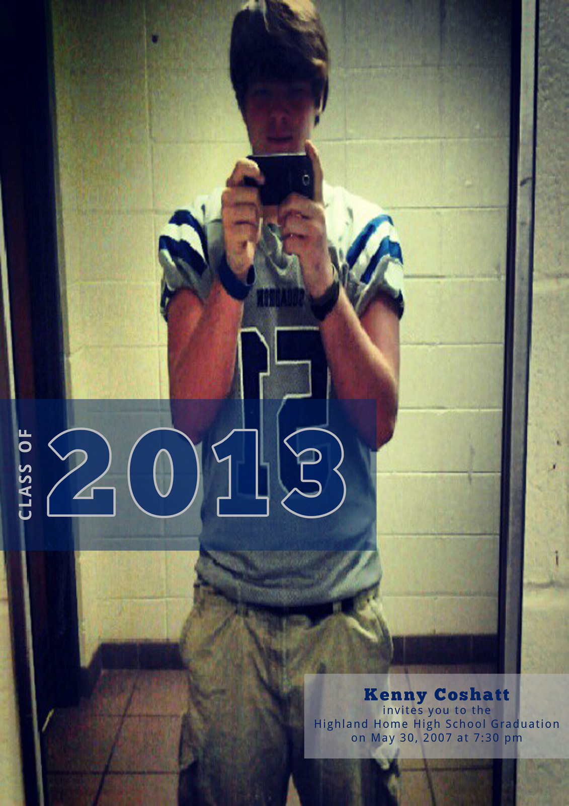
I somehow managed to hire myself out for free to design my brother’s high school graduation invitations. Of course, he forgot to mention the deadline for getting his actual invitations through the school to anyone. So, it was either spend $100s or get someone to do it for free.
I haven’t done any print work since college, but I figured this might be a neat project. He opted for a fun, “high school” look rather than classy and elegant, so that’s what this design idea is based on.
The following are quick rough drafts of what I have in mind. Ignore the photo (I’m getting a better one) and the extremely rough spacing.
Do you like the general direction? Hate it? Ideas and feedback are welcome.


Awesome design.
Thnks
Amazing Design.
Inspiration for me. Thanks
i can’t even comment because thoughts of HS are giving me living nightmares.
I really love it, especially the first one. Great job and nice of you to save your brother/parents some money!
I was looking for some inspiration for my sister’s invites. this just gave me an enormous amount of creativity juices. nice and cool design. I’d pick the first design.
Is that the actual picture used? :/ Can’t someone take a photo of him instead of a self-photo with a camera in it?
As for the design – love your ideas here. Well done!
I’m guessing you missed this:
I can see your developer roots in the monospaced body font
. I’d watch how that prints, especially since it’s reversed type. Might be safer to find a font that was meant for print.
The 50/50 split to content/image looks nice. You could also play with a golden ratio layout but it might not be worth it. It looks nice as is, especially if the new high res image complements the blue/gray content area.
Its really attractive and eye-catching design. I like it…….